While on my writing retreat in western Massachusetts, I realized I had no idea where I was going. Well, not me but my characters. I was 80,000 words into my manuscript, characters were leaving the city in which much of the action takes place, and I couldn’t recall whether they were heading north or south. I wasn’t sure how long the trip from point A to point B might take.
There was even the eye-opener when I realized that my primary city, which I’d always envisioned on the western coast, actually faces east as one character ruminates on the sunrise over the ocean.
Oh crap. Without realizing it, I’d put the city on the opposite side of the continent (yes, I know…it’s a fantasy world and if I want the sun to come up in the west, I possess the godlike authorial powers to do it, but that would just be too jarring for readers). So, not only had I flipped the city in my mind and on the page, I had lists of cool-sounding places within the city, cities rivers and mountains throughout the country, and countries on the world, and I suddenly knew I’d lost track of where the hell everything was.
I and my characters were lost.
I needed a map.
No, not just one map. I needed three maps. I needed the city of Selmar, the country of Regintine, and the world of Amastria.
Without them, I was losing control of the narrative, the distances, the timing. and that’s something that drives me crazy.
I enjoy Kristen Britain’s Green Rider series very much, but every time I read the eponymous debut novel, I always have to grit my teeth in one or two sections where characters are in one place and, then in the next chapter, someplace in a completely different part of the country with no recognition of the distance between the locations or the time required for travel. It’s ironic, as Green Rider focuses so much of the narrative on the journey of the main character, a journey that takes many days and gives a wonderful sense of the scope of the country. I wonder how the editor missed that discrepancy.
I admit, I got a bit anal about not wanting that to happen to me. My weekend writing posse can attest to the fact that those little details bug me to no end, and I want to get them right. Hence, the sudden realization that I needed a map.
So, I set off for a nearby town and coffee shop for a change of venue and, rather than writing for several hours as planned, I instead employed artistic skills better suited to cave drawings to sketching out three maps on my iPad as a means of fixing in my mind where things were in relation to one another.
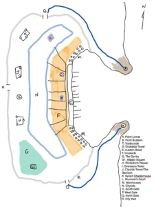 The maps sucked.
But they did what I needed them to do. I could see the world I was creating.
That was pretty cool.
When I finished the manuscript and printed it the first time, I made sure to include those maps. They still sucked, but they also offered a physical anchor, a necessary guide, to this new world.
Skip ahead six months.
Heavy revisions are underway on the manuscript. I am planning ahead for a new website to serve as my digital home as an author (Hi there! Glad you found me! Welcome!). And it occurs to me that better maps would be a nice graphic element on the website and also bestow a sense of credibility when a brilliant agent realizes that my novel is exactly what she/he/they are looking for. So, at the recommendation of a mutual friend, I reached out to Jason Audet, fellow marketing professional by day and illustrator by night.
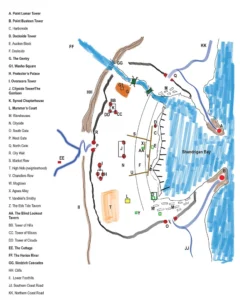 What followed was a fascinating process. I turned over my initial, awful map along with excerpts from the manuscript with the detailed descriptions of places and buildings. I even redid my original map into something more detailed but that still sucked just as much. I expected a cleaned up, fancy version of the direction I’d gone.
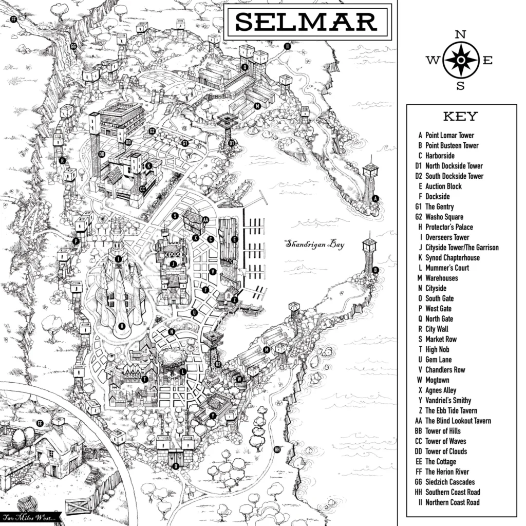
Instead, Jason returned with questions seeking details that had never occurred to me. What did the walls of the city look like? What the primary construction materials for the buildings within the city? He laid out a plan to focus on the major elements, magnifying them for clarity while building an extensive city of streets, squares, and blocks around them.
I sent photos of places, things, animals, and more to help Jason envision the designs I had in mind. He ran with those and came back with pencil sketches that were far beyond what I’d hoped for. The basic lookout towers at the harbor mouth became towering lighthouses. Waves rolled through the harbor and lapped against the stones.
Our back and forth about places and structures forced me to think in greater depth. I realized not only that one major venue was in entirely the wrong place in my original maps but that, yes, I really did need to add a waterfall and cliffs thank you very much for narrative reasons. Due to a minor misunderstanding, Jason put a tower in the wrong location but I realized that, yes, he can put the right tower where it needed to be but the other tower…why, of course, it makes perfect sense to have it there! Quick, tweak the manuscript to account for it.
The illustration effort, which Jason initially thought might go for a few weeks, extended through the summer with regular status checks, more questions, photos of bits and pieces initially in pencil, and then in ink. Then it extended into the fall. With every new iteration or additional neighborhood, Selmar became ever more real to me. Then, finally, it was done.
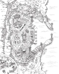
The map was complete. A place key and labels were added. It looked amazing.
“I think the key should be white with black type,” commented my wife shortly after Jason and I congratulated ourselves on a great collaborative effort. “The white text on the black key draws all the attention that you really want on the map.”
Tappity tappity tappity…and an email went off to Jason asking if he could, actually, change just this one last tiny little thing. In the end, she was right, of course. Black on white was the way to go.
And so, four and a half months or so after we started, the city of Selmar became even more real for me. I could see it. I could picture my characters moving among the buildings that Jason created based on his interpretations of my words. I dropped it into the new version of the manuscript before I printed it for the next round of revisions and cuts.
Has Jason’s artwork displaced the vision of the city that I had in my head as I wrote the manuscript? Yes but also no. It’s no different than reading a book and then seeing the movie version. Sure, the movie version will visually stick in your head but, in my case, it was my words that led to the visual version. It was my input that provided Jason with the elements upon which he crafted his interpretation with my feedback throughout. At the same time, Jason’s inspired illustrations drove me to rethink and refine the manuscript itself, bringing them into closer sync and resulting in a better book.
It is so cool. I can see my city. It’s right there in front of me on the computer. Eventually, the original pen and ink drawing will be framed and hung by my desk here at home. Seeing really is believing.
And we’ve still go two more maps to go…
